top of page

Milton Glaser
Booklet | Spring 2024
I was tasked with designing a 16-page booklet that highlights the work and unique style of Milton Glaser, a visionary graphic designer and my chosen design hero. I selected Glaser for his signature approach to portraiture, which features exaggerated details, surreal embellishments, and intricate decorative elements infused with psychedelic motifs. His typography is equally distinctive—playful, experimental, and full of energy—contributing to the dynamic and expressive nature of his compositions.
Mood Board
Fonts
This mood board is a vibrant representation of Milton Glaser's iconic design style, characterized by bold colors, psychedelic patterns, and imaginative portraiture. His work often combines organic, flowing shapes with striking contrasts and layered compositions. The color palette includes warm tones like mustard yellow, deep reds, and earthy greens, alongside bold black and white contrasts.
I explored a range of typographic options and experimented with adjusting elements such as size, weight, and spacing. Through this process of testing and refinement, I was able to identify the typefaces that not only complemented the visual aesthetic but also reinforced the concept in a meaningful and cohesive way.


Sketches
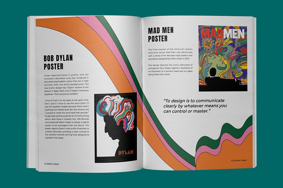
I've started sketching my initial ideas for the front and back covers. I wanted to incorporate Milton's freestyle design elements, like his signature swirls and expressive lines, and also include some references to his iconic work. For the interior spreads, my goal was to showcase Milton Glaser’s iconic work by capturing his bold, free-spirited style on every page. I carefully selected and arranged elements that reflected his expressive use of color, playful forms, and dynamic compositions, ensuring that each spread felt true to the energy and creativity that defined his career.


Digital Drafts
After completing my initial sketches, I imported them into Adobe Illustrator to begin the vectorization process. This allowed me to refine the pattern illustrations with clean, scalable lines while preserving the integrity of the original hand-drawn concepts. I then introduced bold, vibrant colors to enhance the visual impact and bring energy to the overall design. Once the digital artwork was finalized, I carefully reviewed each element to ensure consistency, balance, and a cohesive aesthetic that aligned with my creative vision.


Final

f&b mk.jpg

Spread 1 Mk.jpg
spread 7 mk.jpg
f&b mk.jpg
1/8
bottom of page